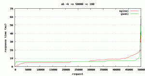
Ab / ApacheBench is a tool commonly used to perform benchmark by many people. unfortunately, the results are displayed somewhat difficult to read by most people. but it can be tricked by turning it into a plot image. this time, I will make examples how to change the results of apachebench into a form of image plots using gnuplot. although apachebench’s report is very helpful, we need to output the data in a parse-able format. To do this we use the -g switch which will output a gnuplot-friendly tab delimited table of data.
First we need to installed gnuplot if we don’t have it yet.
$sudo yum -y install gnuplot
In this example i’ll benchmark request on static png file.
Run first webserver benchmark
$ ab -k -n 50000 -c 100 -g server1.txt http://server1/server1.png
Run second webserver benchmark
$ ab -k -n 50000 -c 100 -g server2.txt http://server2/server2.png
Example result server1.txt/server2.txt
starttime       seconds ctime   dtime   ttime   wait
Tue May 10 16:42:28 2011        1305020548      0       2       2       2
Tue May 10 16:42:28 2011        1305020548      0       2       2       2
Tue May 10 16:42:28 2011        1305020548      0       3       3       2
Tue May 10 16:42:28 2011        1305020548      0       3       3       3
Tue May 10 16:42:28 2011        1305020548      0       3       3       3
Tue May 10 16:42:28 2011        1305020548      0       3       3       3
Tue May 10 16:42:28 2011        1305020548      0       3       3       3
Tue May 10 16:42:28 2011        1305020548      0       3       3       3
Now we’ll convert tab delimited tables datas into a nice image plot
Create plot template file called template.p, so it can be re-used easily for later test.
# output as png image
set terminal png

# save file to "benchmark.png"
set output "benchmark.png"

# graph a title
set title "ab -k -n 50000 -c 100"

# nicer aspect ratio for image size
set size 1,0.7

# y-axis grid
set grid y

# x-axis label
set xlabel "request"

# y-axis label
set ylabel "response time (ms)"

# plot data from "server1.txt" and "server2.txt" using column 9 with smooth sbezier lines
plot "server1.txt" using 9 smooth sbezier with lines title "server1:", \
     "server2.txt" using 9 smooth sbezier with lines title "server2:"
Run gnuplot to generate graph
$ gnuplot template.p
Here’s an example of gnuplot graph


Creates an empty image file. Is this missing a command from the template?
was your ab command resulting any data?
Yes, data produced, it looks like this:
starttime seconds ctime dtime ttime wait
Thu Jun 26 16:22:12 2014 1403796132 0 9 9 9
and so on